TABLE OF CONTENTS
Tools to Support Hand-Placing Elements
Grid lines and locking items can assist with placing widgets on a card.
Grid Lines
Grid Lines can be enabled in the bottom right corner. An image of how the Grid Lines appear in a card when enabled is shown below.
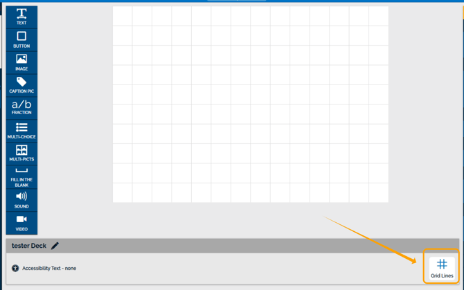
Grid Lines can be used to inform your arrangement of elements in a card by hand.
Item Lock
Item Lock is available under the Item Settings drop-down.
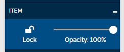
This setting is helpful to lock an element. All elements are automatically locked while you edit other elements to prevent unintentionally editing some you're not working on. You can use the setting to manually lock an element once you are happy with its placement in your card.
Unlocking Elements
A locked element will have a gray outline with a white lock.
You can unlock an element by clicking the white lock or the Unlock button in the Item Settings.

Tools To Automate Positioning Elements
We have a few tools available in the Studio that can help users position and arrange elements in their decks much more precisely than possible by hand.
Positioning Individual Elements
Individual elements include Text, Buttons, Image, Fill in the Blank, Sound, Video, and all Group Containers, including Caption Pictures, Fractions, Multi-Choice, Multi-Pictures, and any customized group containers you make.
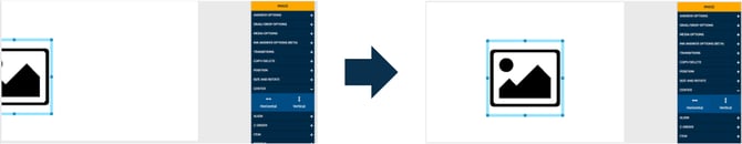
Position Setting
The Position Settings allow you to position elements down to the pixel. The Position Settings allow you to control the size of the selected element down to the pixel by using the arrows or typing in the text box directly.
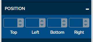
The Top box corresponds to how many Pixels are between the top line of the element and the top of the card.

The Left box corresponds to how many pixels are between the Left side of the element and the Left limit of the card.

The Bottom Box corresponds to how many Pixels are between the Bottom line of the element and the bottom of the card.

The Right box corresponds to how many pixels are between the Right side of the element and the right limit of the card.

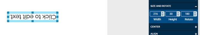
Size and Rotate Setting
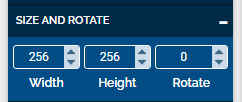
The Size Settings allow you to control the size of the selected element down to the pixel by using the arrows or typing in the text box directly.
Rotate allows you to rotate the element by degrees; you can use the arrows or type in the text box directly.
For example, if 180 degrees is entered in the Rotate box, the element will be upside down.
Note: Size and Rotate settings will overrule any rotate and flip settings available in the Image Tools settings.
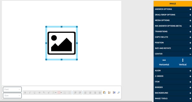
Center Setting
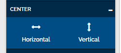
The Center Settings can be used to center an element in the card, either horizontally or vertically.
When the Horizontal button under Center settings is clicked, the selected element will be pulled into the horizontal center of the card.
When the Vertical button under Center settings is clicked, the selected element will be pulled into the vertical center of the card.
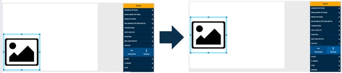
If you need an element centered horizontally and vertically, you can click both buttons to achieve that effect.
Aligning Multiple Elements
Not all settings are designed for individual elements. Below are the settings you can use to align elements in relation to each other in a card.
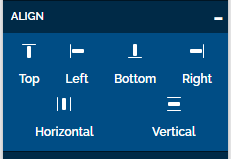
Align Setting
The Align setting allows you to align multiple elements. To use this setting, highlight or select all relevant elements in a card.
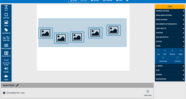
You know you have multiple elements selected if they all have a blue outline, shown below.
The Align Settings option includes aligning with the Top of your card, aligning with the Left of your card, aligning with the Bottom of your card, aligning with the right side of your card, aligning horizontally, and aligning vertically.
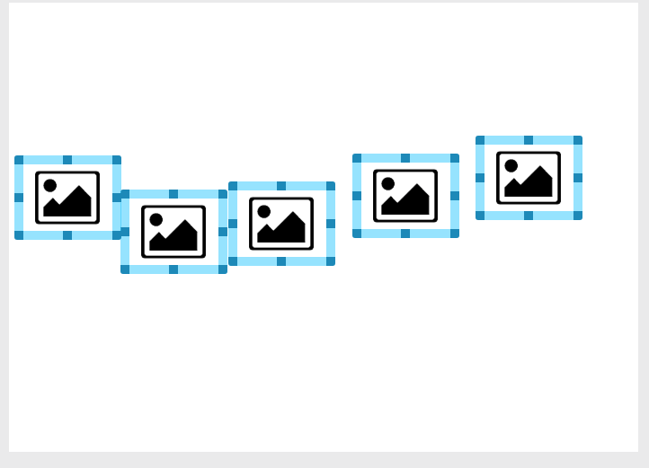
If your Elements are in a haphazard line across your card, the Top, Bottom, and Horizontal buttons will achieve the same effect. All of the Elements will be aligned in a straight line horizontally.

If your Elements are in a haphazard line down your card, the Left, Right, and Vertical buttons will achieve the same effect. All of the Elements will be aligned in a straight line vertically.
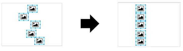
Once the elements are aligned, you can hand-place the line in your card as a unit.
Please note, if you click a Top, Bottom, or Horizontal button and Left, Right, or Vertical button all of your elements will be pulled into a stack and it might look like you only have one element.
If this was not your goal, you can click Undo at the top of the card editor at any time.

If you have any decks that you have specific questions about, you can email us at Help@boomlearning.com, and an agent will happily help you.